


I’ve been using the Procreate app since 2016, through countless updates this same feature has remained my favorite and now I’m sharing it with you!
The day I brought my iPad Pro home, I was SO excited to start lettering. I’d been doing calligraphy for about a year and a half and I’d mainly been using brush pens and traditional calligraphy pens, nibs, inks, etc.
I plopped down on the couch, downloaded a drawing app, grabbed my shiny, new Apple Pencil, and started writing the name of my business “H-e-w-i-t-t A-v-e-n-u-e”. Insert *yikes* moment and shocked emoji. My beautiful lettering I had worked so hard on looked terrible. It was shaky, uneven, inconsistent…I was instantly horrified/nervous/disappointed. Was this iPad going to be a huge waste of money for me? Was it the WRONG tool for me?
Okay, okay, maybe that sounds a bit dramatic but at the time I was a new business owner, inexperienced calligrapher, and a busy medical student on a strict budget. The thought of investing $1500 on a side business and then find out that my calligraphy looked worse on the investment? I was a little scared I hadn’t made the right decision.
I hopped on the internet and put a few things in my Amazon Prime cart that I thought might make transitioning from paper to iPad a tad easier (screen cover, pencil holder, glove, etc). Just like I had done when I first started lettering, I practiced, practiced, practiced. I even made quite a bit of progress! My calligraphy looked better but it was still SO SHAKY. But then, the lovely people at Procreate designed StreamLine, and let me tell you, it was like they added a magic wand to my lettering.
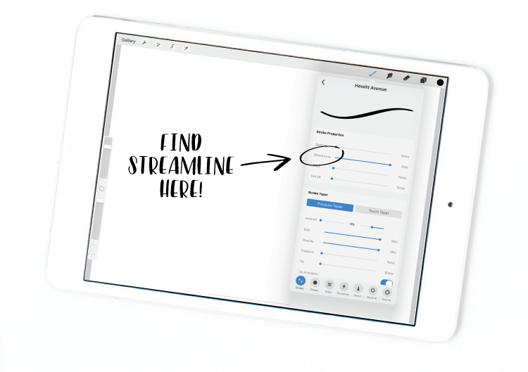
Where do you find it? See the screenshot below! Turning up StreamLine will stabilize any stroke you make with the pen. It smooths out any shakiness in your hand and makes those flourishes look oh-so-perfect. Keep in mind, the higher the setting, the more StreamLine will smooth out your strokes.
For lettering and calligraphy brushes, I typically keep the StreamLine setting really high (90% – Max).
For painting and illustration or when I want to use my regular handwriting, I like to turn down the StreamLine setting wayyyy down to make it a more sensitive.


The comments +